Feather
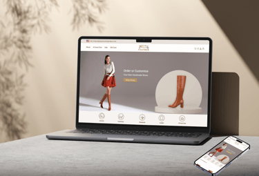
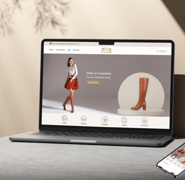
An adoptive web design of woman's handmade shoe store focusing on customizing shoes and AI exact shoes size.
Project Overviwe
As part of the project, the website includes advanced AI scanning technology on its mobile version to accurately measure customers’ shoe sizes.


Feather is an online handmade women's leather shoe store located in LA , USA . Feather was a school project and we focused on design and build a prototype website that provides an easy-to-use shopping experience with options for customization.
Role
UI/UX design
Team
Group of 4

Duration
12 Weeks
Part Time
Tools
Figma, photoshop, Canva,Word Zoom, Google Form
Business Needs
Provide an online website for existing leather handmade shoes shop
Implement a customization feature that helps shoppers to personalize their shoe selections according to their preferences
Use smart technology for accurate sizing, as the company customizes the shoes
Make sure the website is easy to use and navigate so that customers can easily explore the products
Business Challenges
Encouraging users to purchase leather shoes online
Simplify the process of customizing shoes
Designing a user-friendly interaction with smooth navigation
Organize categories and filters
Design Process
Discover
Define
Develop
Deliver
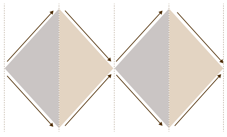
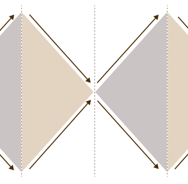
We used double Diamond method based on the Design Thinking Methodology.
Survey & Interview
Affinity Diagram
Competitive Analysis
Cart Sorting
User Persona
User Flow
Site Map
Sketch
Mild Fidelity
Useability Test
Wire Frame
Visual Design
Mood Board
High Fidelity
Useability Test and Iteration
Needs
Goals
Research
Design
Discover
Define
Develop
Deliver
Discover
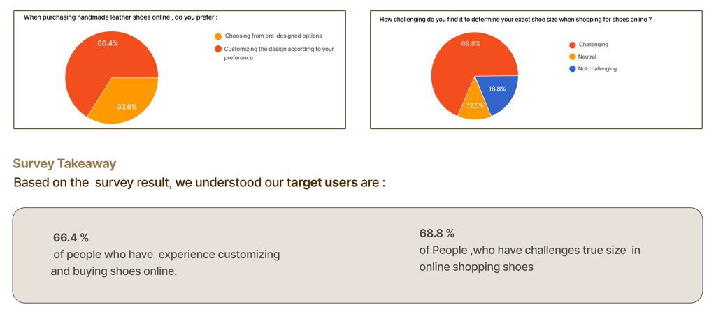
Survey
To better identify our target audience and their challenges, we created an online survey and shared it with relevant communities
Interview
We interviewed our target users to identify important pant point and areas of concern .We asked open-ended questions and let them talk more. It was the most educational part of our research and it really assisted us throughout our design process .
Website :
Webmobile :
Instruction for how to scan your foot
The steps of scanning the foot from the camera's phone provide the exact size and are user-friendly.
provide filters and categorization on pages
The user friendly structure of customize page
Competitive Analysis
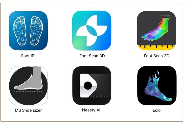
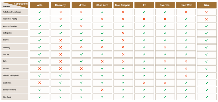
We analyzed similar websites, examining their features and workflows to gain insights and 6 similar Application for exact foot size. Our approach involved studying websites an Apps with similar business models and getting ideas from them.
Webmobile Analysis
Website Analysis
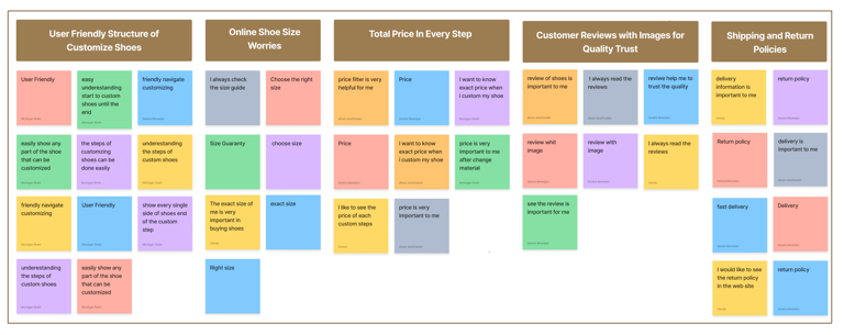
Affinity Diagram Takeaway
The affinity diagram that was made accordingly .In our research for designing this website, we found out some important stuff on :
The user friendly structure of customize page
They also really want to easily find the right size
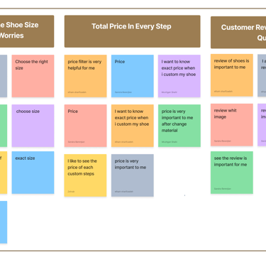
Price awareness matters to them too
Customer reviews of shoes were also found to be important
Shipping details are regarded as important by customers
Define
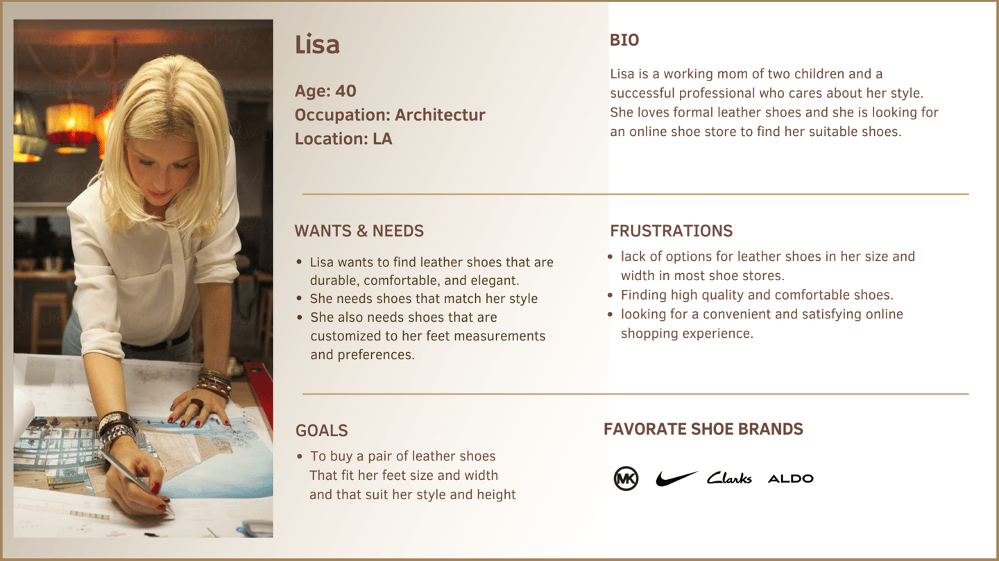
Persona
have made quality our habit. It’s not something that we just strive for – we live by this principle every day.

User Flow
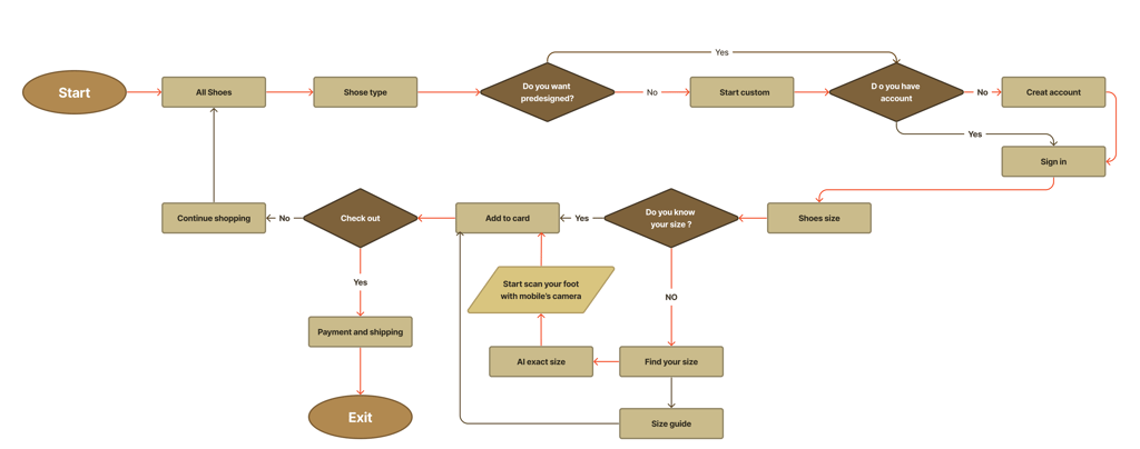
User flow was developed accordingly.
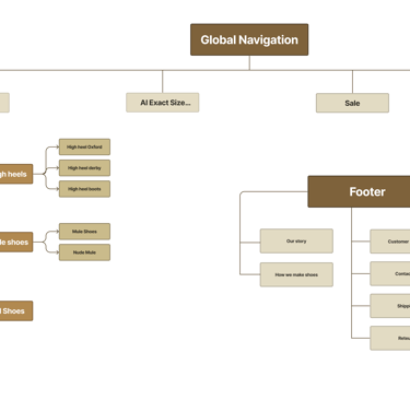
Site Map
Based on the card sorting , the first version of the information architecture was made . However through out the design process, user testing and the competitive analysis , the final version of the information architecture was builds build .
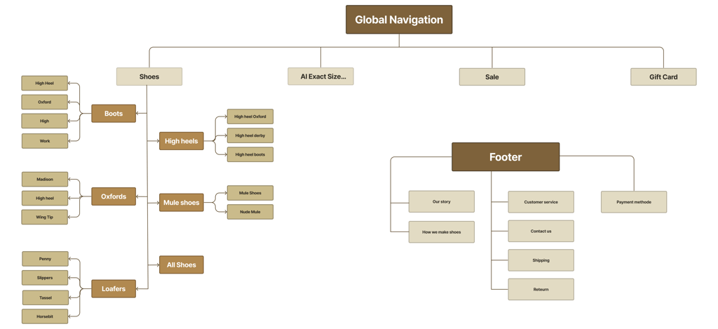
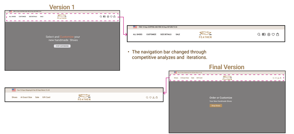
There are some iterations on the landing page that helped us to develop information architecture in the final version.
Develop
Sketche
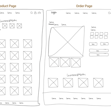
Based on the information we have received during our research, we drew some sketches to lay out ideas for our features.

Wireframes
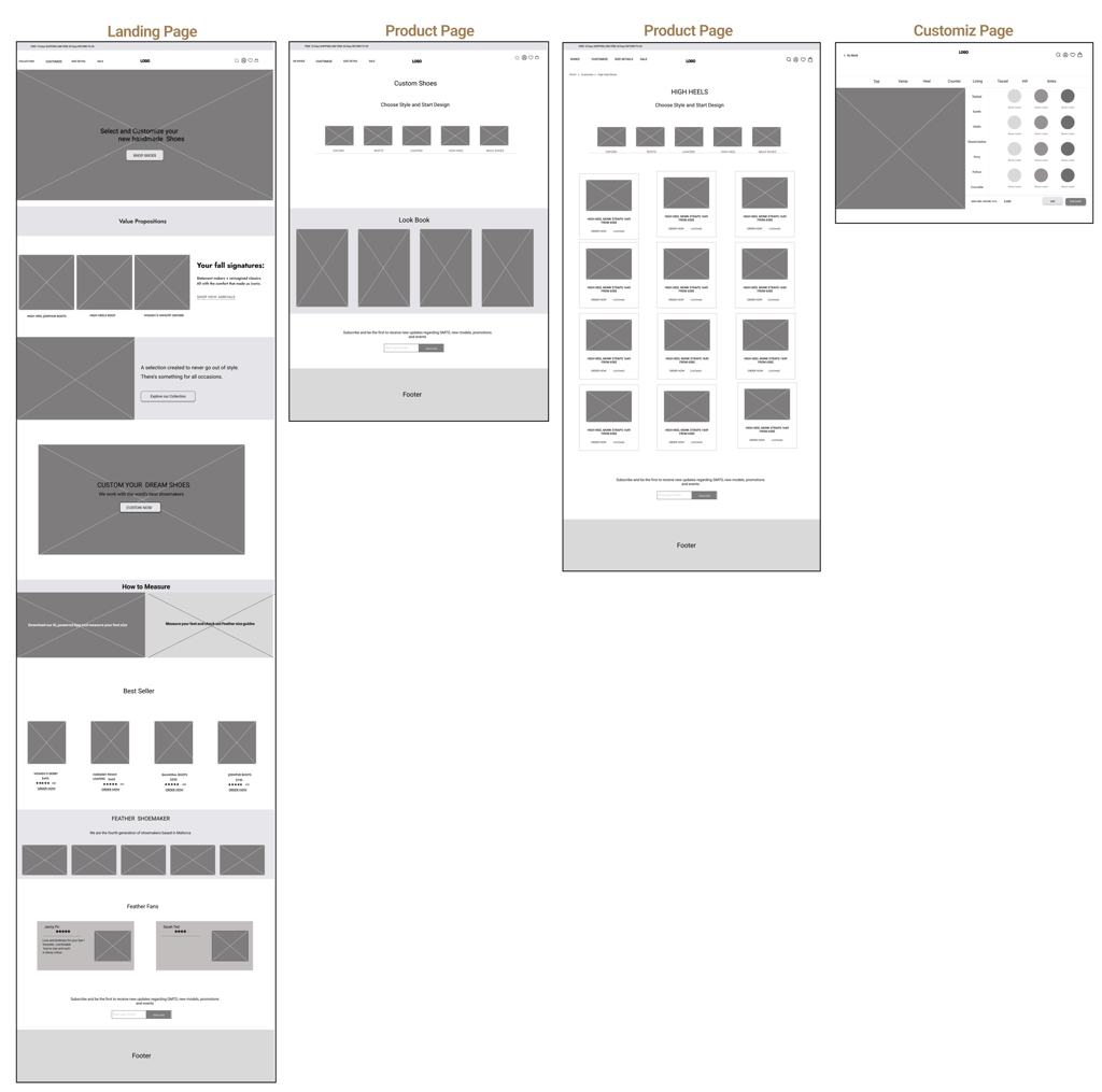
By using Figma and fallowing our sketches, we created mid-fidelity wireframes and prepared them for useability test.
Useability test & Iteration (Phase 1)
After creating mid-fidelity wireframes and before we go to high-fidelity, we did some useability test and we found our paint points and solutions.
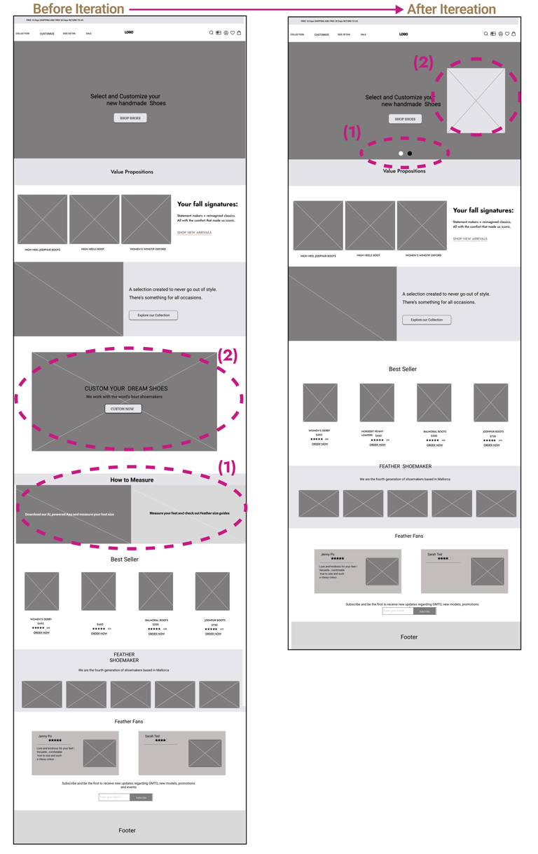
(1) The placement of the AI exact size feature on the homepage were missed by users. Through iterations, we put it in the hero image as a slideshow.
(2) The positioning of the customize feature on the homepage was unclear for users. After iterations, we decided to include it in the hero image.
Landing Page
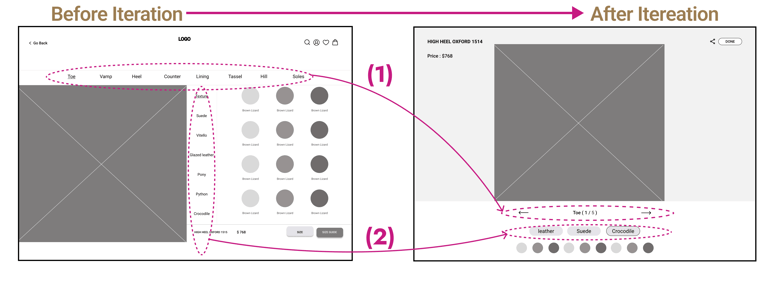
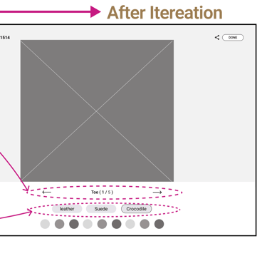
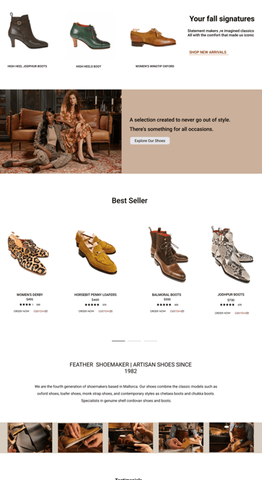
(1, 2 ) The first design caused confusion among users, so we made changes to the layout to make it clearer and more user-friendly.
Custom Page
Deliver
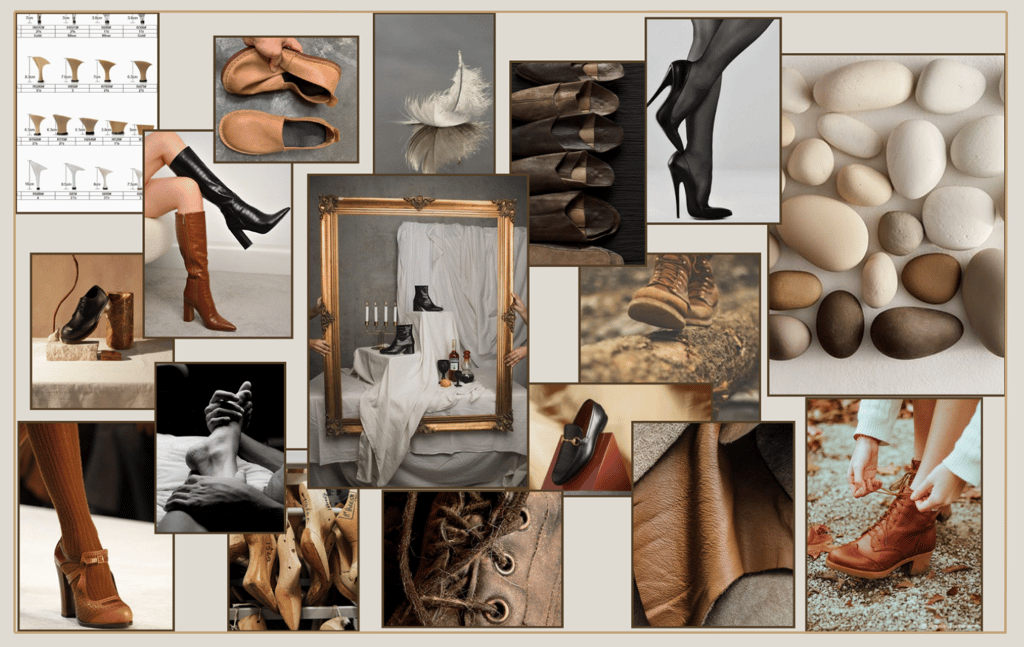
Mood Board
While creating the mood board, we were inspired by feathers, leather, wood and stylish shoes. Based on the mood board, we chose the primary color.
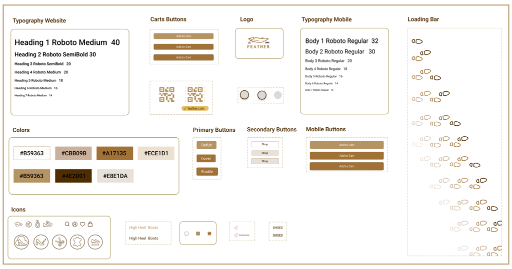
UI Kit
We made a UI kit with color codes, font sizes, icons, components, and variants for the design process. We have chosen
Solution :
1- Showed the changing price at every step of the customization process.
2- Added a 360-degree view at the end of the customization process.
3- Users can click on each customization step,visually showing their selections by changing the selected part of the shoe to white.
Design Solution
Upon thorough analysis of all our research data, we gained a comprehensive understanding of the challenges associated with our project and attempted to address them by incorporating a solution into our design.
Solution :
1- Used eye-catching visuals, customization and value propositions in the hero image .
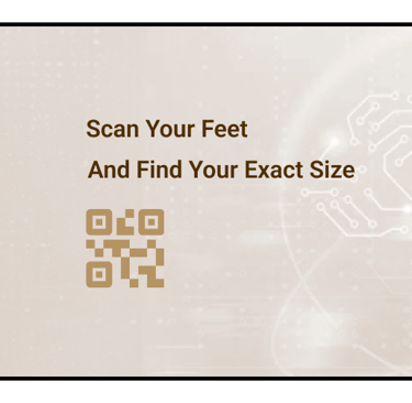
2- We added the AI exact size to the global menu and included a mobile mockup gif on the homepage .
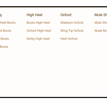
3- Put a picture of each style in the category menu .


Challenge :
easy-to-use shopping experience with options for customization.


Challenge :
Used eye-catching visuals, menu and value propositions in the landing page .
Landing Page
Customization Process
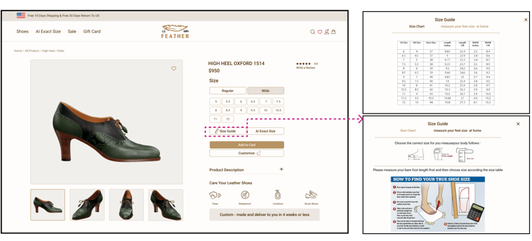
Solution :
1- Added a size guide chart with exact measurements .
Order Page
Challenge :
provide a size guide for those who prefer to measure themselves.
Useability test & Iteration (Phase 2)
We conducted 10 user tests to assess the website's functionality. During high-fidelity prototype development, we tested to resolve confusion. Valuable feedback from these tests led to a lot of changes to the design.
Landing Page

Customiz Page
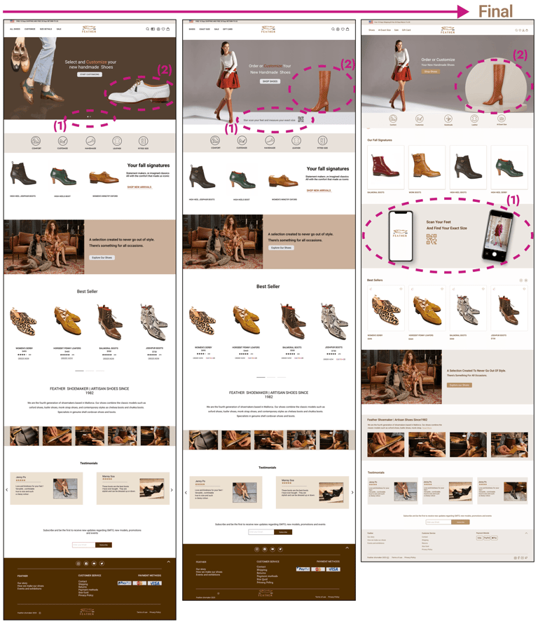
(1)The AI exact size feature on the slide show was missed again by users. So we showed it directly on hero image ensure better visibility and usability for users.
(2) Iterations, we changed the picture of the hero image to a high heel style to better express the understanding of the women's shoe website.
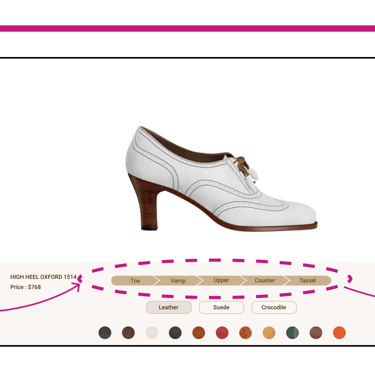
(1) We showed customization shoe parts all at once to be more user-friendly and clear.
(2) To enhance user understanding, we implemented a feature where clicking on each step highlights the matching
shoe part in white.
Mobile Scan
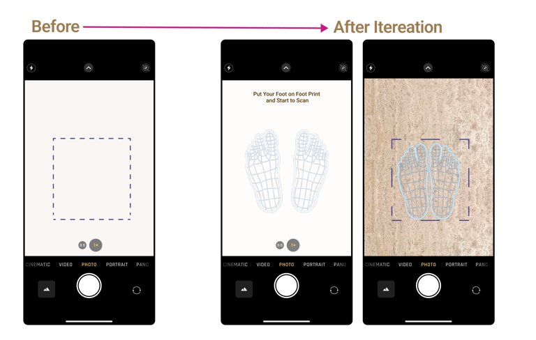
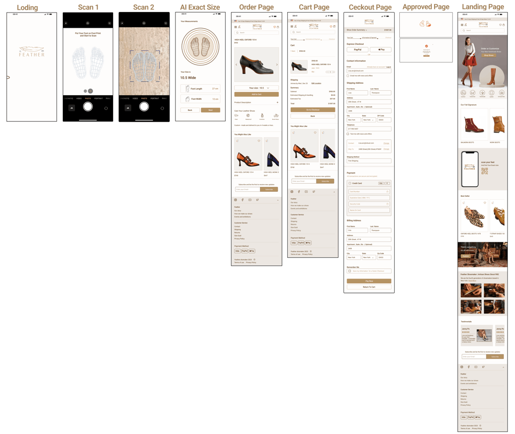
Users don't know how to scan their foot , we put instructions and a footprint picture to make it clear.
Product page
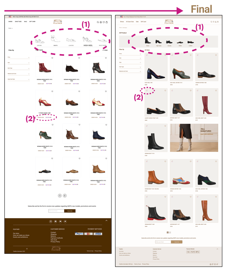
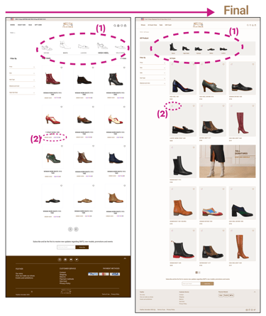
1- We replaced real images of shoe styles with the sketch images, to increase better visibility and clarity for users.
2- both the 'order now' and 'customize' options in the product cards were linked to the same page, after iterations, they were combined into a single icon for better efficiency and clarity.
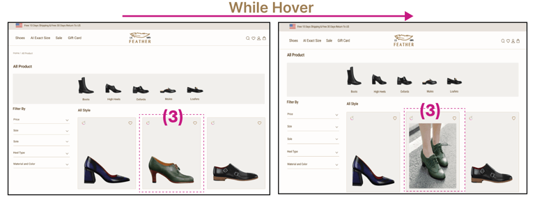
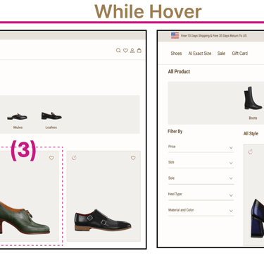
3- Added pictures of shoes being worn on the foot in every product card.

A/B Testing
After running an A/B test with 10 participants to evaluate user satisfaction and functionality for category menu and AI exact size feature designs, we found a preference for sample B over sample A , both in terms of functionality and visibility.
B
A

A
B


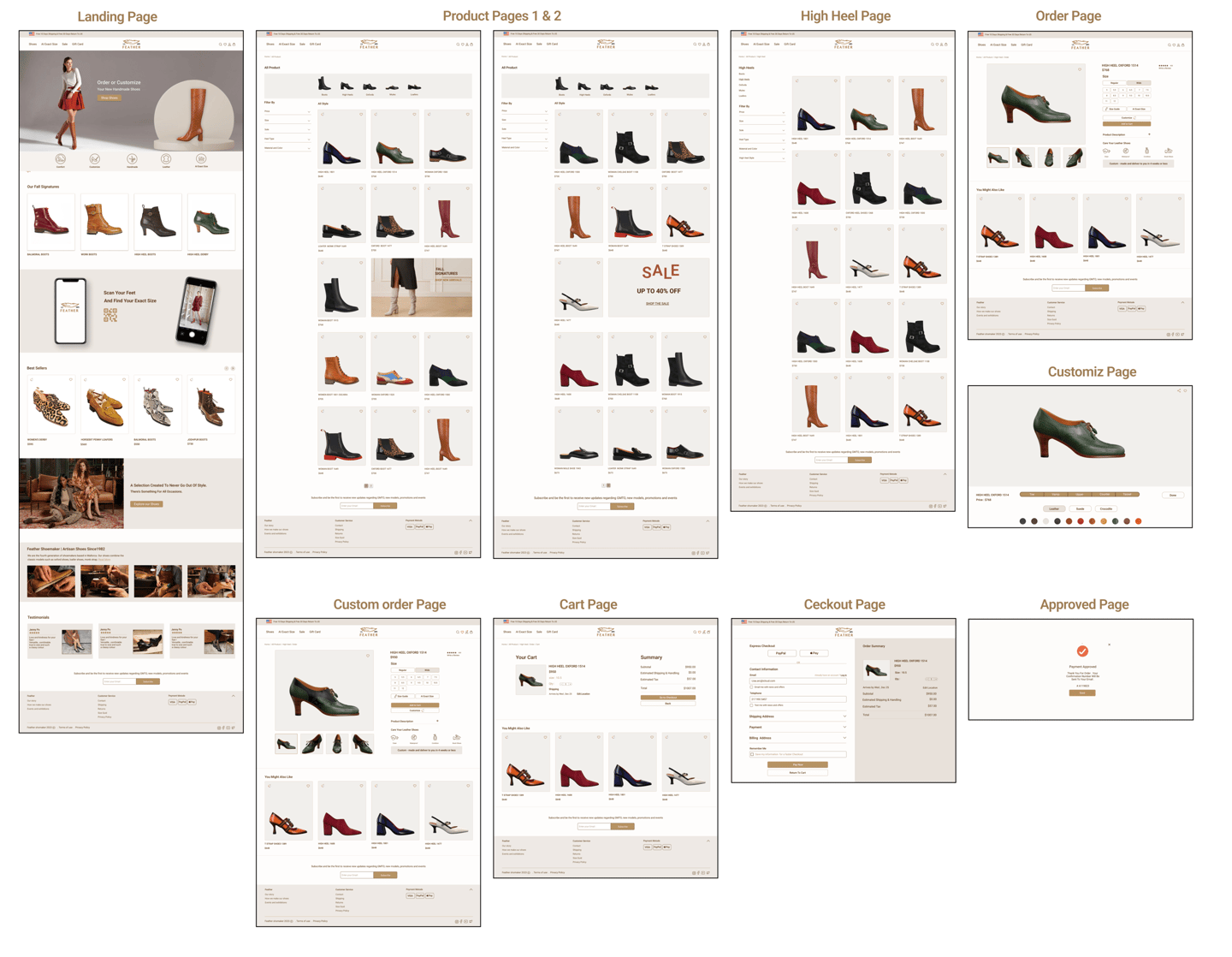
High Fidelity Wireframe
Desktop version
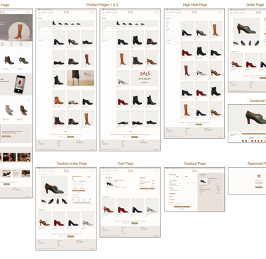
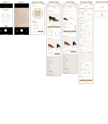
Mobile Version Design
We had to design and iterate for mobile version as we have an adaptive website .
REFLECTIONS
What did I learn?
In this project, I've learned the importance of collaboration with teammates. By working together, I've gained valuable insights and a deeper understanding of different perspectives as well as improving communication skills. This collaboration has allowed us to create more comprehensive and user-friendly designs.
I also learned professional prototyping, designing a UI kit with detailed interactions, and advanced hierarchy and information architecture for a large amount of content in this project.
I am sure learning wouldn't stop in this field and I will work on it all the time.
