
Toronto Cupcake
Redesign a website


About Toronto Cupcake
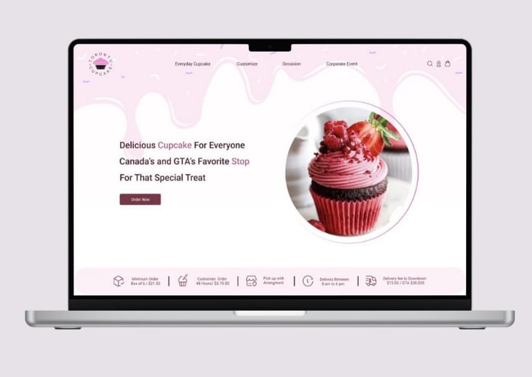
Toronto Cupcake is a local business in Toronto, Canada, specializes in handmade cupcakes with customizable options. However, the website is outdated and lacks important details. The complicated ordering process makes it hard for all customers to place orders, often discouraging them from using the site.
Project Overviwe
Role
UI/UX Design
Team
Group of 2

Duration
12 Weeks
Part Time
Tools
UX Research
Figma , Canva
Zoom , Google Form
Problem
The main menu was hard to find, making it difficult for users to explore the website.
Hidden Navigation


The website's inconsistencies negatively affected the user experience, making the website seem unreliable .
Low-Quality Photos
Checkout Problems

Inconsistent Design


The cupcake pictures were low-quality and didn’t attract customers.

Complex Customization
The customization options were unclear and frustrating for users, leading to a poor experience.


The checkout process was confusing and caused customers to leave without buying.
Goal
Attract users by making website visually more attractive.
Provide an easier navigation.
Simplify the process of customization
Make the shopping and payment process easier by designing a user friendly website.
Design Process
We used double Diamond method based on the Design Thinking Methodology.
Heuristic Evaliuation
Interview
Affinity Diagram
Competitive Analysis
Cart Sorting
Site Map
Persona
User Flow
Sketch
Useability & Iteration
Wire Frame
Mood Board
UI Kit
Visual Design
High Fidelity
Portotype
Useability Test and Iteration
Problem
Slution
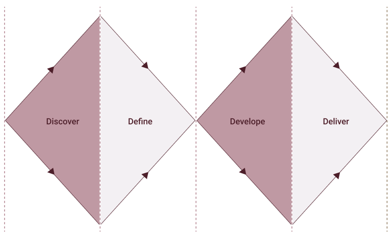
Discover
Define
Develop
Deliver
Discover
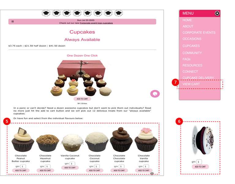
5. There is no filter or sorting option to make finding cupcakes easier.
6. There's no information about each cupcake , like ingredients , price or reviwes.
The website has low-quality and careless product photos.
The website dosen't mention the best- selling cupcakes.
7. Adding a cupcake to the cart doesn’t show any feedback, confusing users about whether it was added or not.
The “view cart” option is hard to find, and there’s no cart icon. Users have to open the navigation bar every time to see the cart.
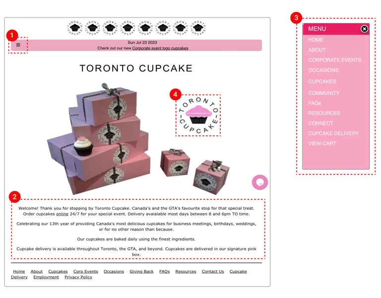
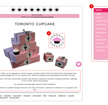
1. The menu bar is in the wrong position and hard to find.
2. The homepage has too much unnecessary information.
3. The navigation bar is messy, and it’s hard to find cupcakes, even though it’s a main option.
4. The logo is a CTA to order cupcakes, but users don’t realize they can interact with it.
Before doing user interviews, our team performed a heuristic evaluation of the website to discover the main usability issues, and to get a better insight on what to focus on during the user research.
The website's design and content are outdated and many issues were noticed.
Heuristic Evaluation
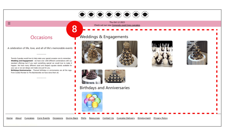
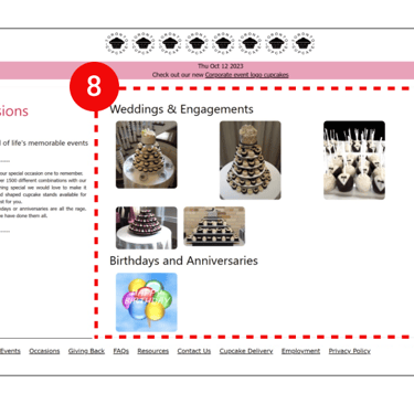
8. The website frustrates users with long texts.
The photos aren't clickable, and there's no button to place orders for birthdays or weddings.
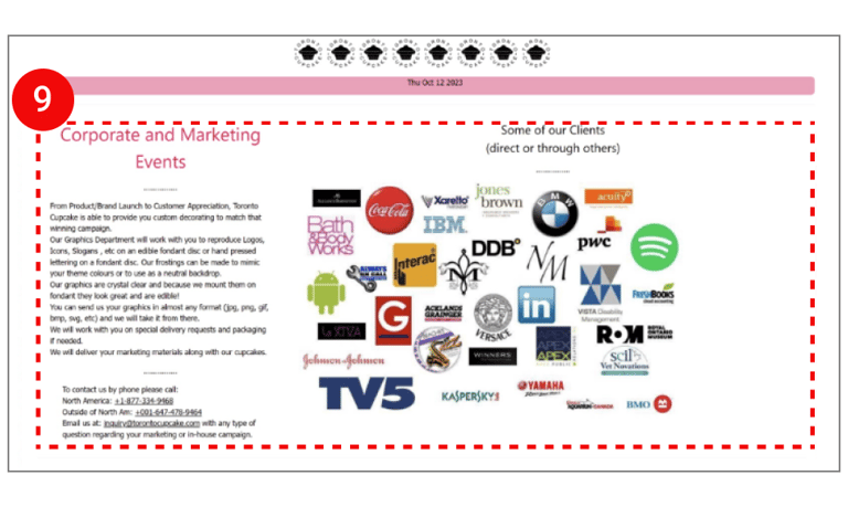
9. The ordering process is super confusing, and in the end, users have no choice but to call or send an email to place an order.
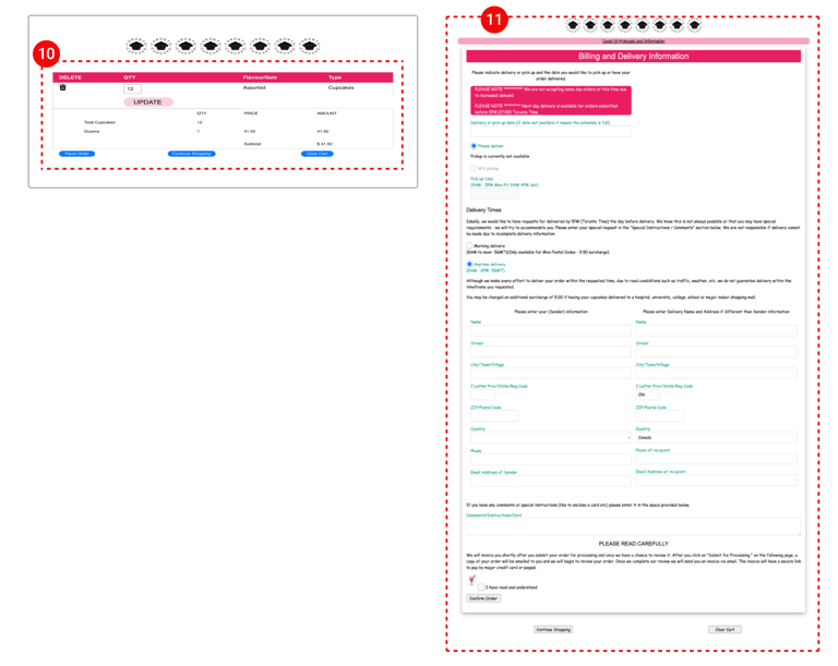
10. The “Place Order,” “Continue Shopping,” and “Clear Cart” buttons look the same, making it easy to accidentally clear the cart.
The shopping cart does not display any image of the purchased product.
11. The “Place Order” page has too much information, and the forms are messy, making it hard to use.
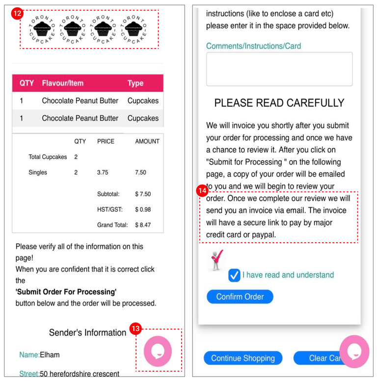
12. A non-clickable, repetitive, and unnecessary logo icon .
13. Completing an online purchase without live chat is almost impossible.
14. Direct card payment isn’t possible. After "Submit Order For Processing" , the user gets an email with the invoice and payment link. The customer doesn’t experience a quick and easy purchase and payment process.
Interviwe
For user research , we interviewed 21 people online and asked them about what they needs and goals when visiting a TORONTO CUPCAKE website , plus their past experiences with similar websites, to make sure our design matches what users actually need and want.
Our main goal was to figure out what really matters to users when it comes to ordering large quantities of cupcakes for events.
The ingredient used inside of the cupcakes
See the price at each stage of the order
The best sellers can help them make a better order
The user friendly structure of customize page and provide
the option to upload photos for customization purposes.
See the best rated and the most reviewed cupcakes
Enabling online payment and specifying delivery information.
Allowing users to view sample photos of the ordered or examples for occasions.
Interviwe's Results
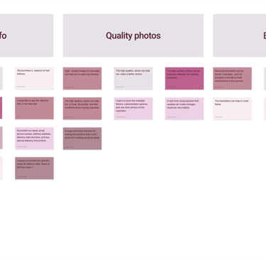
Affinity Diagram

Competitive Analysis
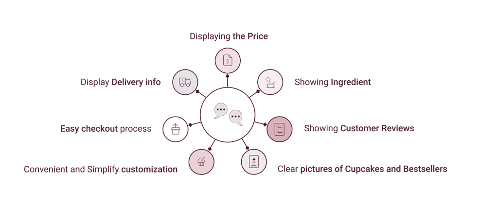
Thorough research of potential competitors, led to the review of five websites that are similar to business plans . We identified through competitive analysis that most websites have an easy ordering process. We decided to consider the below options .

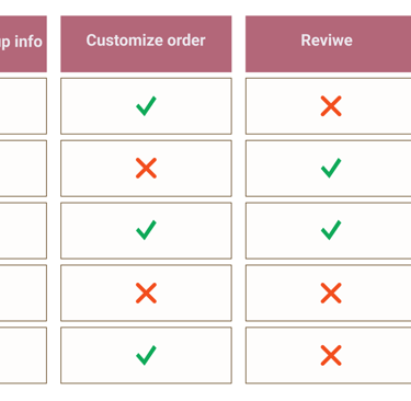
Creating a user-friendly website with an easy navigative for online ordering.
Allowing users to view reviews and photos from previous customers.
Clearly specifying delivery information.
Displaying the ingredients used in the cupcakes
Takeaways
Top Insight
By providing a recap of our research, we will be able to stay focused and on track.
Difine
Card Sorting
We conducted an open card sorting from competitive analysis and heuristic evaluation of five existing websites. 12 people participated in the online research, and they were able to create their own categories. The following is a sample of one of the card sorting.
